Member Sales – Date Matrix
This is a Club Prophet Executive Report v4 – Power BI or PBI
Note: Samples are using demo data and do not reflect real world data.
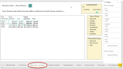
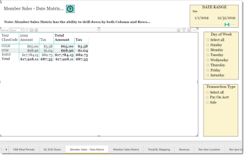
The Member Sales – Date Matrix is a matrix report that shows the Amount of Revenue and Tax per Date period. A Matrix report is a multi-dimensional Drill-Down type of report that can drill-down by both or either row and column.
So, in the example about the From-To date “slicer” is set for the entire year of 2019.
The visual (at the default top level) is showing:
- Column Totals at the bottom of the visual.
Note: Since there is only one column, Amount and Tax, the Totals on the right side look redundant. This will make sense later.
- Year: 2019
Then for each row:
- Class Code
- Income Amount
- Tax Amount
- Row Total Amount
- Row Tax Amount
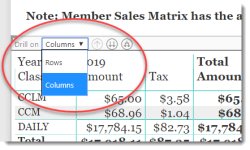
If you select the visual, you will notice that the Drill-Down control is a little different as it now has a selection for Rows and Columns.
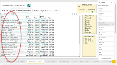
Let’s start by selecting Rows which is the default selection and select the Down-Arrows.
Just like a typical Drill-Down, the report now shows the data but by the Customer Name and Account Number.
Select the Down-Arrows again and it will show by Sale Number and Account Number.
Now use the Up-Arrow to work your way back to the top or until the Up-Arrow is grayed out.
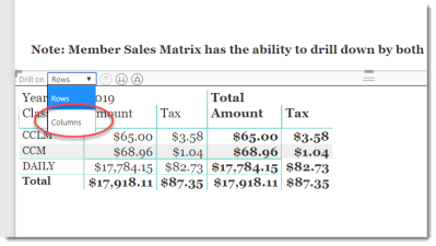
This is where it gets interesting! Let’s change the Drill On from Rows to Columns and repeat the drill-down routine:
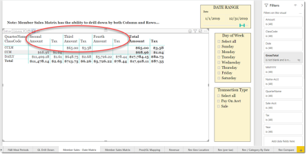
On the first drill-down, you go from showing the year (2019) to showing the quarters (First - Fourth) for the year:
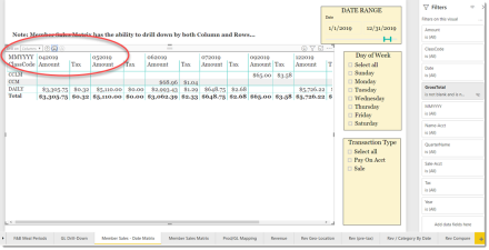
Select the Down-Arrows again and it drills down to month and year (MMYYYY)
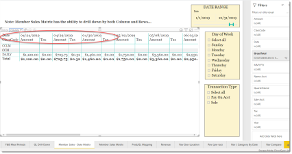
Drill down again and you see the data by date.
You are now at the bottom of the column Drill Down and the Down-Arrows are now disabled. Let’s drill your way back up to the top.
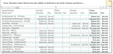
So now, you can use a combination or rows and columns and mix and match any way you like. Let’s say that you wanted to know customer spending by quarter. You would drill-down on rows to the customers and drill-down on columns to quarters to get this:
Drilling back up to the top level for both rows and columns gets you back to here:
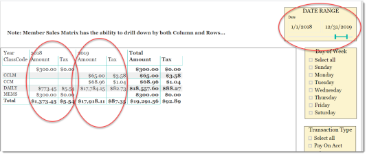
Matrix/Date type reports are really good at comparing one year to another. Let’s change the date range to look at all of 2018 and 2019:
Note this is just demo data so there are gaps but you get the concept.
Now the first circled column shows what the given Class Code generated in 2018 for amount and tax and then the second circled column show 2019 values.
Remember the Total column on the far right seamed redundant at the start of this guide? Now it makes sense.
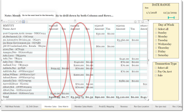
Want to compare individual customers spending between 2018 and 2019? How about by each month?
Use the Matrix drill-down in rows to get to customer and drill-down in columns to get to MMYYYY and you get the following:
Again, with demo data so it’s sparse but you see how the first column shows spending in April of 2018 vs. the second circled column which shows spending in April of 2019 for each given customer account.
FILTERS
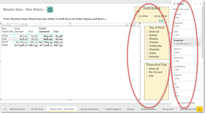
There are various filters you can use to narrow down the data. Filters are the gold background controls as well as the Filters right hand sidebar.
Tips
- Filters which are the gold back color controls on the report allow you to pick from a list. Hold down the Ctrl key on the keyboard to select multiple items.
- If you want to search for a particular value, use the filters in the right pane menu. They will have a search box in addition to a list of the items.
- Use the Advanced option in the right menu panel for advanced search options.
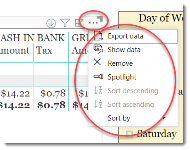
- Use the three dots […] in the top right of a visual for more options like Export data.
- Use the Help button to open the user guide for any given report
 .
.
